
Packaging Design Helps Sell Product
November 3, 2020 | 9 min to read
Originally printed in the October 2020 issue of Produce Business.
Clever and cute are catchy, but winners keep the beauty of produce as a feature.
Packaging is a key part of a supplier’s sales force and remains a necessity in merchandising fresh produce. The days of simply identifying a company’s products on its packaging through its name and product are over. By placing effective marketing messages on packaging, produce shippers and marketers can define and differentiate their companies from competitors.
“Companies don’t have a choice anymore,” says Roy Ferguson, chief executive officer of Chantler Packages, Inc., a Mississauga, Ontario-based manufacturer of flexible packaging. “They have to draw the customers’ attention as they push their shopping carts through the store. The only thing the companies can do is with packaging design. It’s a necessity.”

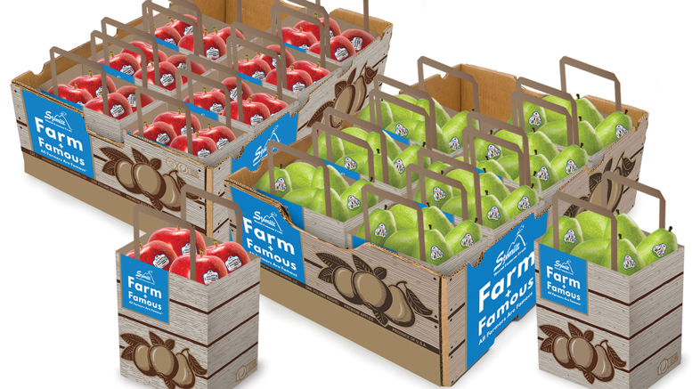
PHOTO COURTESY OF CHANTLER PACKAGES
Underestimating packaging’s role in sales and marketing is difficult. “Many studies have shown we have less than three seconds to catch shoppers’ attention in-store, so it is critical that your message and label work for your brand,” says Kristin Yerecic Scott, marketing director of Yerecic Label, in New Kensington, PA. “We always say packaging is the only piece of marketing material that stays with a product throughout its entire life. From the point of purchase until the time the consumer eats the product, we have a clear opportunity to provide valuable messaging and education to shoppers.”
The space on packaging is a valuable sign or marketing space that can be used to educate shoppers on how to consume the products. “The messaging we have to portray to customers through information is key,” says Joe Bradford, vice president of sales for PPC Flexible Packaging, Payson, UT. How the industry transmits that information is much better in the past 10 years, he says. “Now we have the billboard, the available real estate to educate our customers,” says Bradford. “Let’s make sure we utilize that real estate. Everyone has the same amount of available square inches on a package. How they use that is up to them.”
“Everyone has the same amount of available square inches on a package. How they use that is up to them.”
— Joe Bradford, PPC Flexible Packaging
Unused space on packaging must be approached strategically. A variety of on-pack messages, including recipe suggestions, storage tips or flavor profiles, can motivate a shopper to purchase a new product.
CONNECTING WITH SHOPPERS
“All of these messaging options are proven to connect with shoppers to inspire them to make that impulse purchase,” says Yerecic. “Research shows that shoppers want as much information as possible, such as recipes, nutrition information and storage instructions, while also maximizing visibility of the product to ensure freshness and ensuring that the packaging is environmentally-friendly.”
Packaging is one of the biggest areas of marketing produce. “The messaging and design of the product’s packaging is usually one of the #1 items out of the gate for a brand,” says Jeff Watkin, director of marketing for Sev-Rend, Collinsville, IL. “If you think about it in terms of exposure, a product’s packaging is critical as a vehicle not only for the product itself, but also the brand’s messaging. You will always see a product that has solid, consistent branded packaging usually move much faster than your generic products even if the actual product inside the package is virtually the same. This comes down to branding which installs confidence in the consumers who believe they are getting a superior product.”

Marketers should exploit their products’ physical characteristics. Packaging should not be overdone, says Roger Pepperl, director of marketing for Stemilt Growers, Inc., which ships apples, pears, cherries and other fruit from Wenatchee, WA. Marketers shouldn’t cover the fruit but only cover the emptiness between where the fruit stops and the packages’ handles begin. “Don’t overwhelm the package with so much noise on it that shoppers can’t see the product,” he says. “Your product is fresh and beautiful. Why take away that experience?”
Produce marketers can take lessons from the pet foods department. To call out logos or other messages, pet food companies employ varying textures of gloss and matte with light refraction. “There are contrasts and things one can do with textures,” says PPC’s Bradford. That can be something as simple as calling out an area, a focal point of the package. “You want shoppers to be able to visually taste what the product is like at the store level,” he says. “We achieve that through graphics, by effectively using fonts and colors and all sorts of printing aspects.”

DESIGNING FOR SUCCESS
Effective logos are essential. “Fred’s turnips doesn’t cut it anymore,” says Chantler’s Ferguson. “You have to design a logo so it draws attention to the package. If there’s nothing special about the packaging, it won’t draw the shopper to buy that pack of avocados.”
A label’s design elements, including color, font and graphics, are dependent on the product’s brand essence, observes Yerecic. Tomatoes geared toward snacking for school-aged children require a product look and feel significantly different from grapes being marketed as a seasonally-exclusive premium product. To ensure effective design, Yerecic recommends companies share their vision and target audiences with the packaging design team.
“One of the most important elements of the produce department is the visual appeal of the beautiful fruits and vegetables,” says Yerecic. “It is so important to select packaging and labels that highlight the product’s natural beauty. Whether your label has a viewing window in the label design, uses a clear film label to allow 100% transparency or is a unique label shape, be sure to keep the beauty of your produce as a feature.”
Design should focus on where shoppers’ eyes and hands land on the package. Bradford recommends taking advantage of touch and sight aspects so shoppers can feel, see and even smell what the product looks like. “Achieving customer interaction is what it’s about,” he says. “When a customer walks by our product, they will see photos, animation, a drawn image on top of a photo, different fonts and textures. It’s not just a sticker that says ‘grown in Mexico’ or a best-by date. That’s what packaging use to be, where the idea was the least amount of information they could give to the consumer, the better. The sophistication that can come into marketing (today) is great.”
Proper design helps sell. “It’s extremely important that the use of graphics is consistent with the brand’s overall design across multiple packaging types for the product,” says Watkin. “It’s a way companies are able to set themselves apart from the competition. You drive home your brand awareness as it’s consistent, which can start with your packaging. Through creativity, as long as that package is functional for the intended product, it will get notice.”
NEW ADVICE
Less common information such as storage advice and how to maintain freshness are increasingly being placed on packages. “It’s great someone is educating the public on how to properly handle, store and care for the produce,” says Bradford. “That is setting expectations for the customers that says they need to consume this produce in X amount of time.”
Lesser-known produce, such as dragon fruit and rambutan, can see sales increases if marketers educate shoppers about the products’ taste and use, says Bradford. “Rather than seeing this weird-looking fruit with no information about it, a package that says ‘great in a salad, here’s a recipe’ with a great photo or image can encourage shoppers to purchase,” he explains.
Formerly requiring a month, today’s package design process can be easily accomplished in a week, says Ferguson. Red is the ideal color for affecting shoppers’ eyes. Yellow and blue remain secondary colors but because they don’t complement the produce, aren’t as widely used on packaging, outside of logos, he says.
“Graphics are an essential part of the sale for every kind of product,” says Ferguson. “With the new technology that’s offered by the printing press manufacturers, it’s (effective packaging designs) going to expand over the years. If you’re a shipper-packer, you have to be on board with developing your brand.”
Marketers should exercise their creativity in using packaging to sell their products. “You need to be unique and differentiated in your approach,” says Bradford. “Everyone wants a different result than their competitor, but no one wants to make their packaging, their process or product look different on the shelf. If you do the same thing as your competitors, you will all have the same results. Being unique and different is such an important part of produce.”
COLOR MY WORLD
Colors are critical. “You have to pull the customer over to your products,” says Ferguson. “You must use colors to distort the retina in shoppers’ eyes so they see your package in the marketplace. You have to make sure the package doesn’t look better than the product in it. Some of these graphic artists can get carried away. You have to scale it back a little bit sometimes.”
Unique shapes and die cuts can transform regular upright film net bags to unique film/net bags that can help distinguish brands to stand out from the competition. “Whatever you can do to set yourself apart from your competitor is critical for retail marketing,” says Watkin. Custom-printed packaging is relatively newer to the produce aisle of the grocery store when compared to other areas such as dry goods. Fresh produce has been sold in the past as individual units or by weight or in one of the plastic bags off the roller. Consumers would place how many apples or onions they need in the bag and call it a day.
“Today, people are more prone to custom-printed consumer pack styles that are in the 2-lb, 3-lb and 5-lb packaging types, such as netted bags or pouches,” says Watkin. “This is allowing the growers, packers and marketing entities to push their messaging, which is creating brand awareness for fresh produce where it used to not be as prevalent. It’s very interesting to think about in the whole grand scheme of the grocery/retail environment. With more unique and sustainable options coming out, custom packaging for fresh produce on the retail side will only grow in popularity.”
With Stemilt marketing smaller kid-sized pears in pouches through its Lil Snappers line, one would think shoppers would assume the fruit is designed for children. Marketers must still promote the fruit for children, says Pepperl. “Because the cereal is round and fruit loops doesn’t mean people understand why they’re called fruit loops,” he says. You have to market it. It’s that simple. In produce, we sometimes forget that. Tell the message. Tell a little about that product. Give a place on the package for people to find more info on it.
The Lil Snappers bags are self-standing and don’t require placement in refrigerator crisper drawers, where bags fog, become dirty and look poor. “Make sure the bag is colorful and one thing you should really try to dominate in,” advises Pepperl. “You want the package to be as pretty at home as in the store.”
Proper vetting of packaging companies is also vital. “Always be sure you are working with a packaging organization that is interested in continuous learning and innovation, because after all, there is so much more than just slapping a label on it,” advises Yerecic.
15 of 16 article in Produce Business November 2020

Have a story to share?
Take a place at Produce Business